CLIENT: Eliassen Rorbuer
FIELD: resort
COUNTRY: Norway / lofoten islands
www.rorbuer.no
Eliassen Rorbuer Branding
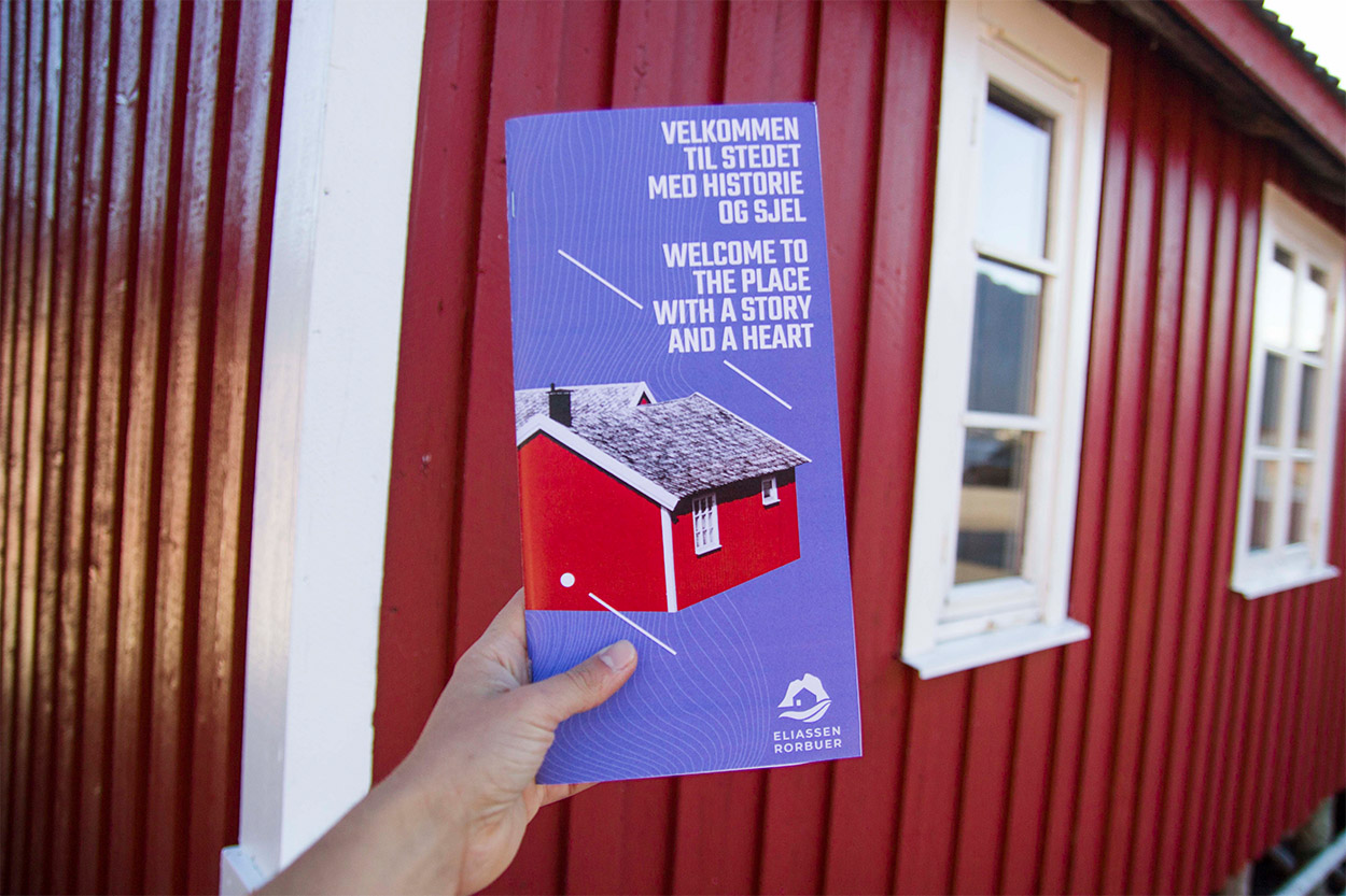
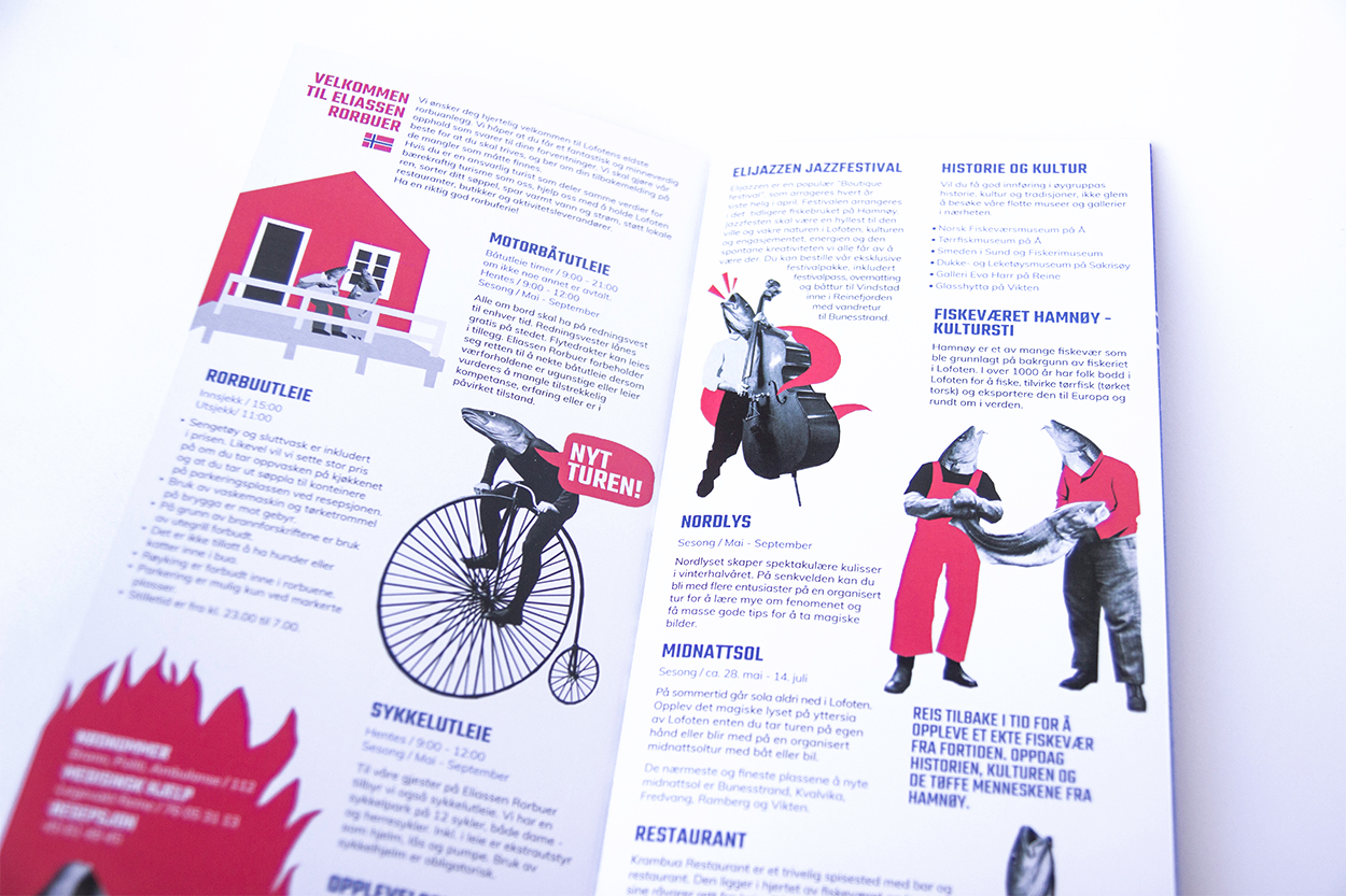
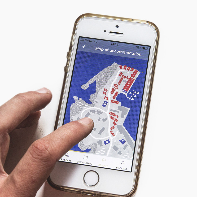
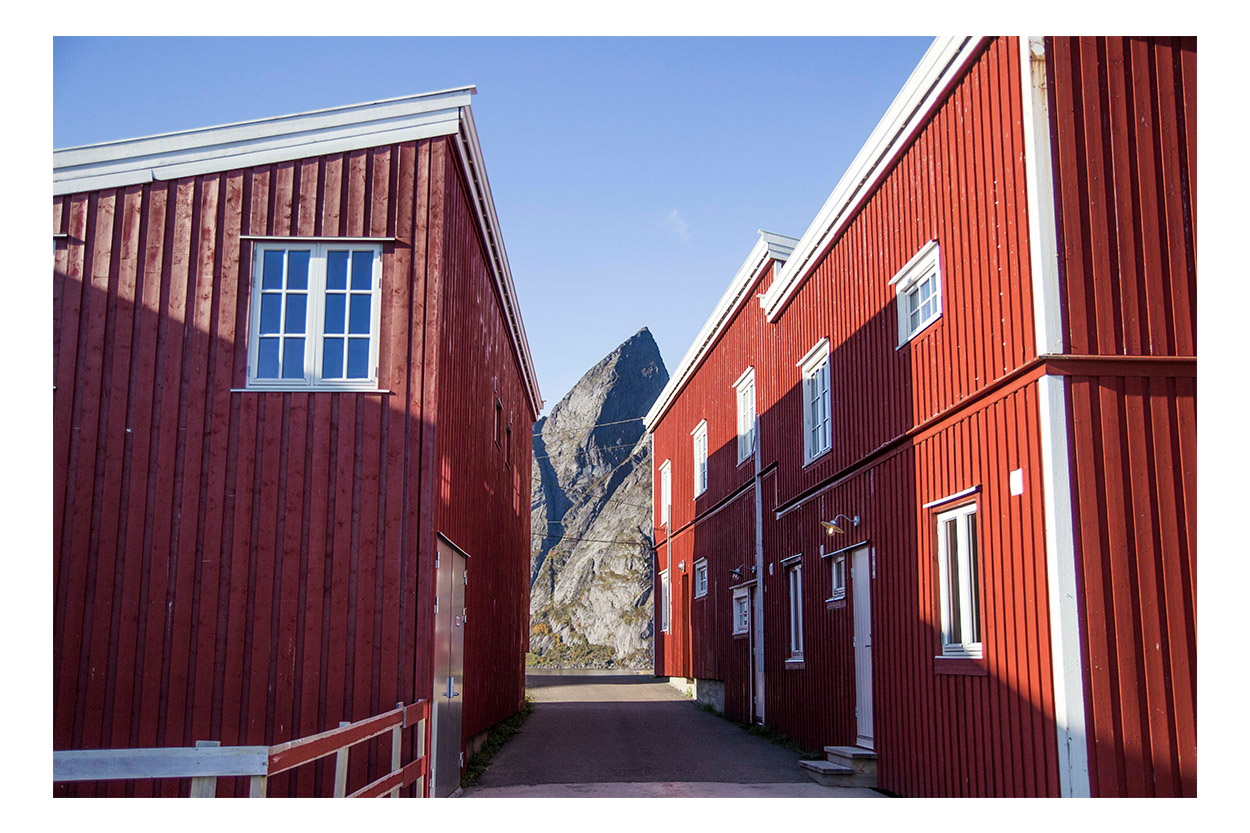
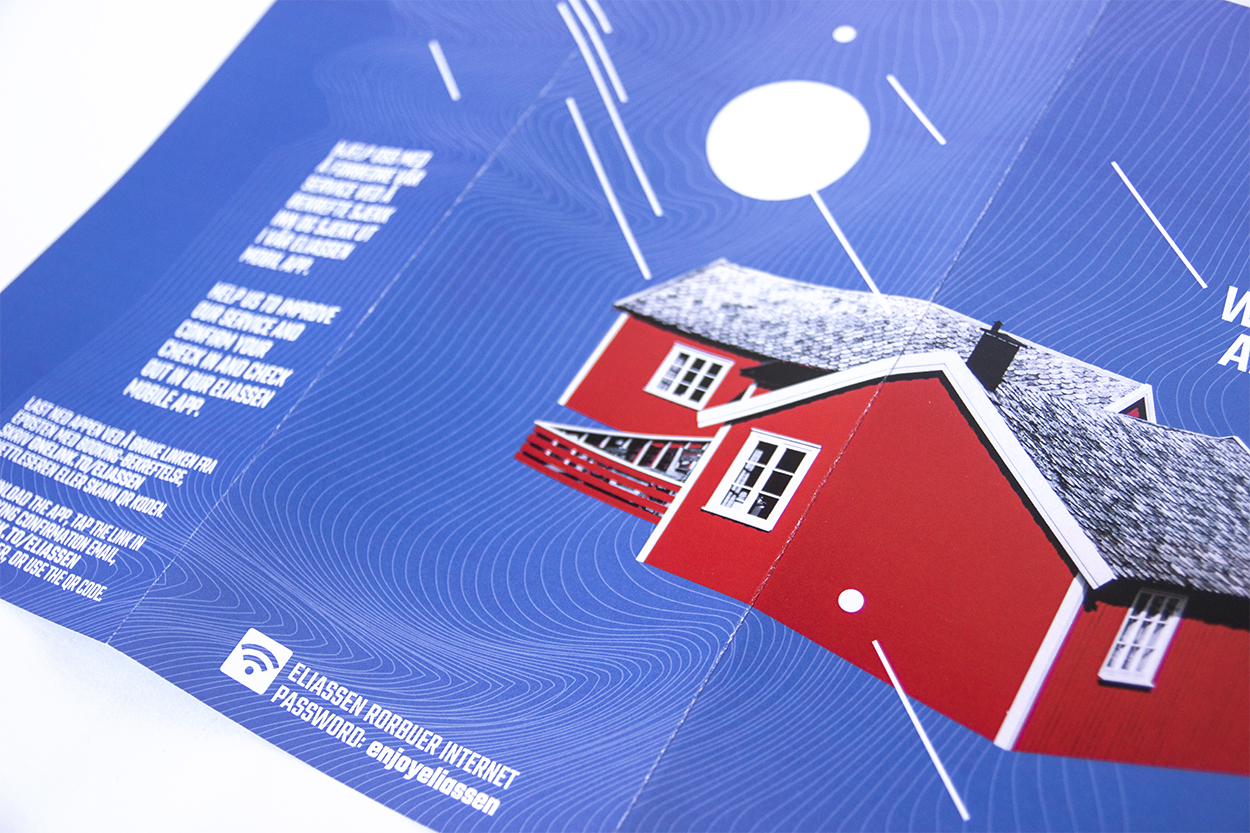
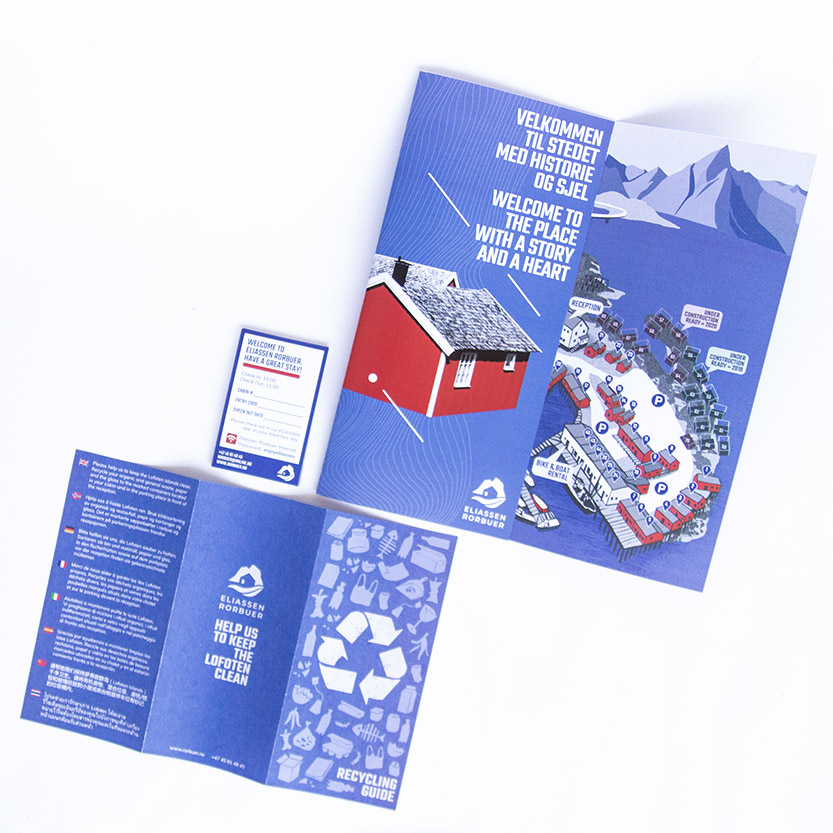
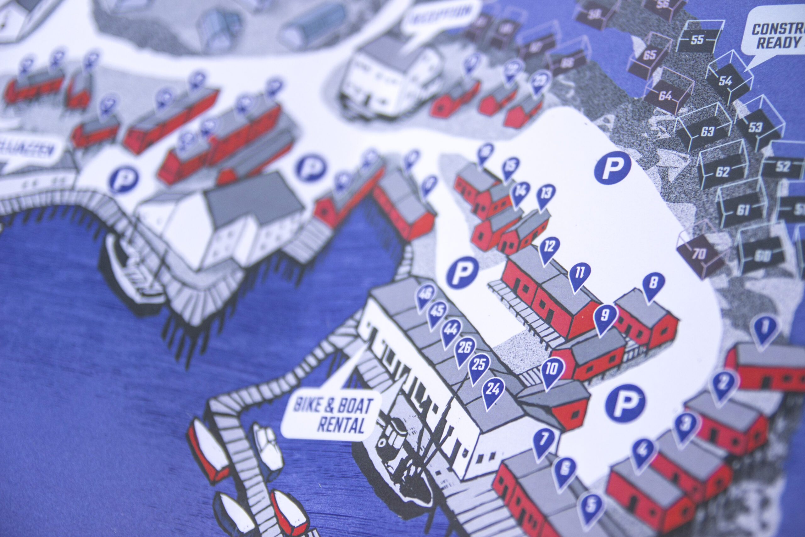
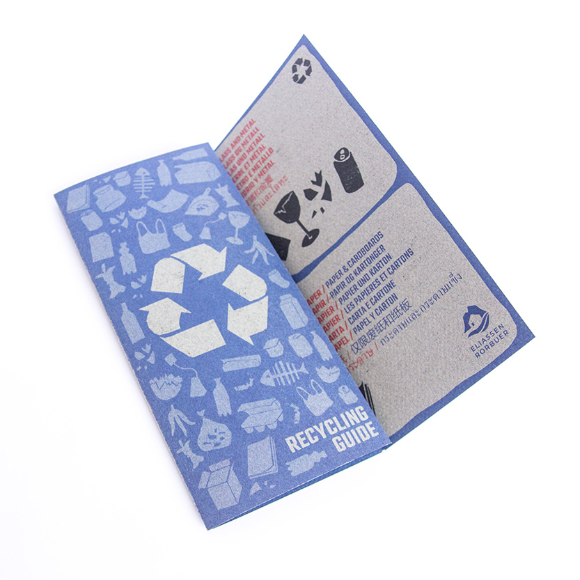
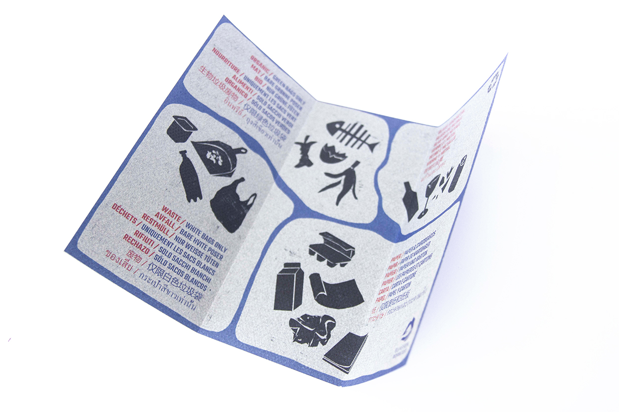
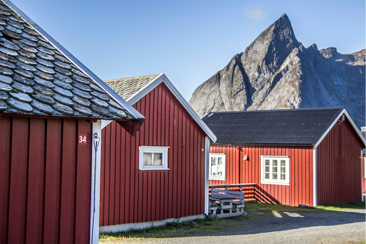
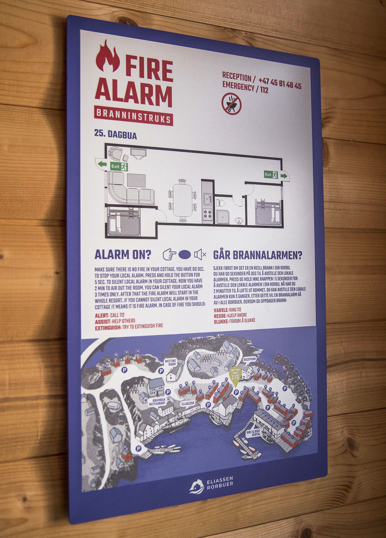
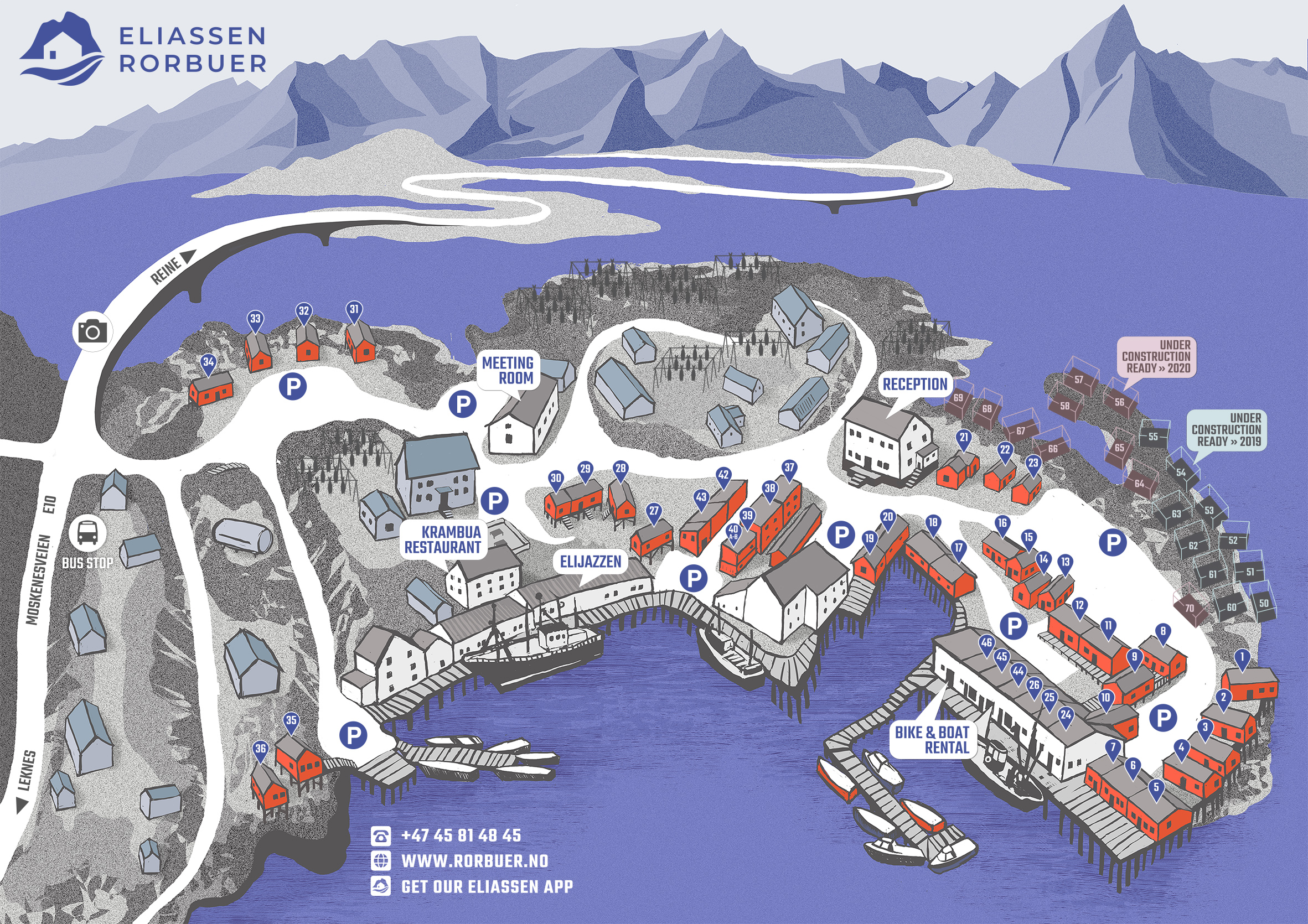
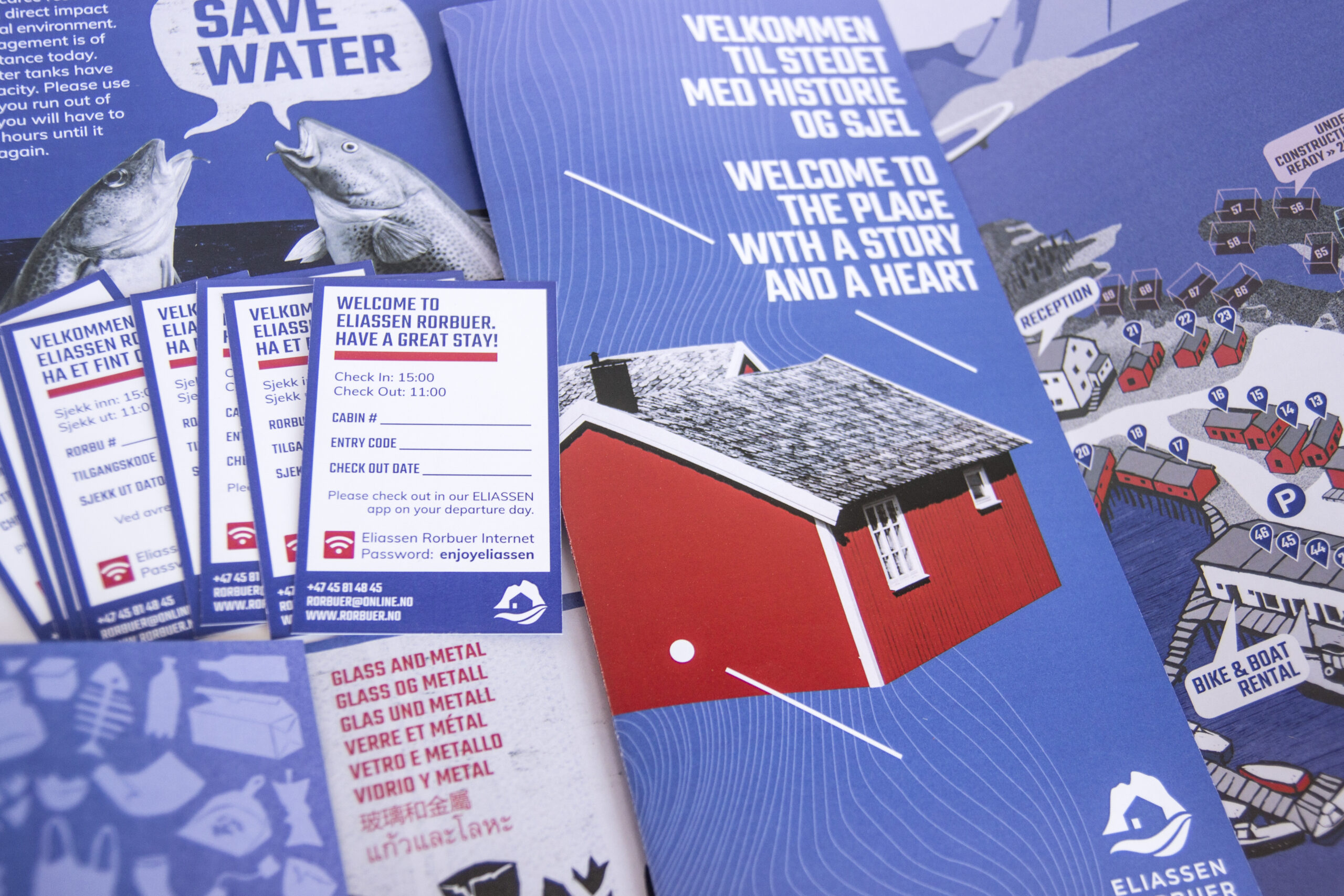
Eliassen Rorbuer, one of the most historic resorts in the Lof Islands, has undergone a complete visual identity redesign. This project included a fresh logo, the design of printed materials for information and navigation, a new website, and a mobile app developed in collaboration with Mobi.Garden. Our design draws inspiration from the breathtaking landscapes of the Lofoten Islands, particularly highlighting the iconic Hamnøy Island, renowned for its red cottages. Emphasizing the resort’s unique character, we aimed to create a cohesive and captivating visual experience for visitors.
our services:
branding
logo design
illustrations
editorial design
web design
eliassen app co-design
photography
Branding
Our design draws inspiration from the breathtaking landscapes of the Lofoten Islands, particularly highlighting the iconic Hamnøy Island, renowned for its red cottages. Emphasizing the resort’s unique character, we aimed to create a cohesive and captivating visual experience for visitors.
KEY WORDS:
red fisherman houses • cold • Norway • cod fish • history • legacy
Web design
www.rorbuer.no
Mobile App visual elements
Together with Daniel Dekański (@mobi.garden) we worked on Eliassen App development. Our responsability was to create all visual elements: icons, illustrations, background images and mobile map design.
Illustrations
- Charming and playful, half cod fish, half human characters became an integral part of the visual identity.
- Hand-drawn map of the resort for both: digital and paper medium.
- Illustrative icons for the mobile app purpouses
Infographics


